Thursday, 19 March 2015

Creating Graphical Indicator Fields in Microsoft Project


Graphical indicator fields can be used to make it easier for people viewing the project plan, to know the status of a numerical field. Instead of displaying the value, a coloured icon is used as an indicator.

By using graphical indicators, a field’s status can easily be viewed at a glance, in much the same way that Conditional Formatting is used on an Excel spreadsheet.

Values or graphical indicators


In this article, graphical indicators have been used to display cost variance (as shown in the image above). If we have overspent on a task then a red unhappy face is displayed, yet if we are on budget then a green happy face is shown.

Creating the Custom Field


The first step is to create the custom field. In this example, we want to create a custom field for the cost variance value.

There is already a field for cost variance, but we want to create an additional one to the one that exists for the graphical indicator.

  1. When in Gantt Chart view, click the Format tab on the Ribbon and then Custom Fields.

Completed custom fields dialog box


  1. Click the Type list in the top right corner and select Cost as the field type. You can see that there are many other types you could use such as text, number and date.
  2. Click Rename and enter a name for this new custom field. The name On/Over Budget has been used in this article.
  3. Click the Formula button. We need to get this field to display the information from the Cost Variance field. Click the Fields button, then Cost and then Cost Variance.
Formula to display cost variance data


Displaying the Graphical Indicators


Now we have our custom field, we need to set it to display the graphical indicators instead of the cost variance value.

  1. Click the Graphical Indicators button.
  2. We need to set the criteria for them. Enter the criteria as displayed in the image below. Choose your own choice of indicator from the Image column.

Setting the criteria for the graphical indicators
 

  1. Click Ok to close both the Graphical Indicators and Custom Fields dialog.

Inserting the Column


Now that the field has been created, you need to insert it into the table.

  1. Right click the column header to the right of where you want the field to appear in the table.
  2. Select Insert Column and find the field in the list by beginning to type its name. In this example it is On/Over Budget.

Graphical Indicators displayed on table


The graphical indicators are displayed in the column. Position your mouse pointer over the field to see the value.

Showing the cost variance as a value


Watch the Video


More Microsoft Project Tutorials

Sunday, 2 November 2014

5 Advanced Lookup Formula Techniques


Lookup functions such as VLOOKUP are some of the most commonly used functions in Excel. They are used to achieve many different Excel tasks.

If you are reading this blog post you have probably used VLOOKUP or one of the other lookup functions before. This article looks at 5 advanced lookup techniques.

Monday, 4 August 2014

The Pie of Pie Chart in Excel Demystified

Pie charts are used to display data points as a percentage of the whole value. Excel provides a few different variations of pie chart to choose from. One with a difference is the pie of pie chart.

The pie of pie chart is used to display the smaller values of a pie chart in a secondary pie to make them more visible.

Take the pie chart below for instance. The loyalty coupon, offline and referrals values make up such a small percentage of the pie chart that they are difficult to read and understand.

Pie chart struggling to handle minor values


Let’s see the same data set using a pie of pie chart. The primary pie displays the smaller values making up 5% of the whole value. These values are then displayed in a secondary pie giving much more attention to the detail.

The smaller data points retain their percentages as a contribution to the whole and lines are used to visualise the enhanced segment easily.

Pie of Pie chart in Excel

Sunday, 13 July 2014

Create Conditional Hyperlinks in Excel

Take your hyperlinks to another level with the HYPERLINK function. This function can be used to create conditional hyperlinks that only display when required. The hyperlinks are also dynamic and can change their link location or anchor text automatically.

In this blog post we will look at both of these techniques.

Monday, 30 June 2014

Forecasting Future Values in Excel

While Excel is not able to predict the future, it is a capable of forecasting future values using existing data.

Excel provides many functions that are capable of predicting future values that reflect past data. These different functions cater for the different ways that your data may be plotted. For example, if your data has a steady growth or if it fluctuates dramatically.

They include FORECAST, TREND, LINEST and GROWTH to name a few.

However in this tutorial we will focus our attention on adding a trendline to a chart to forecast future values.

Adding a Trendline to a Chart


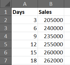
For this example we will be using the sales data displayed below. We would like to forecast the sales for the next 3 periods (9 days) based on the sales from the previous 6 periods (18 days).

Previous sales data


Click the Layout tab on the Ribbon and then Trendline (This option has changed a little over time. This example is for Excel 2007 and 2010).

Select More Trendline Options.

Add a trendline to a chart


There are 6 different types of trendline to choose from for your chart. The list below explains how you can decide which one is best for your data.

Linear – Used for values that increase or decrease at a steady rate.

Logarithmic – Used for values that increase or decrease quickly before levelling out.

Polynomial – Used for values that fluctuate.

Power – Used for values that increase or decrease at a specific rate.

Exponential – Used for values that increase or decrease at increasingly higher rates.

Moving Average – Averages out the high and low points smoothing any fluctuations.

Select the trendline that best suits your data from the options provided.

In the Forecast Forward field, enter the number of periods in the future that you wish the trendline to display for.

Before we add the trendline, another useful option in this dialog box is the Display R-squared value on chart checkbox. The R-squared value represents the accuracy of the trendline.

This value is a number between 0 and 1. The closer to 1 that the value is, the more accurate the trendline.

The image below shows a linear trendline added to the chart. It has an R-squared value of 0.8236, which is fairly accurate.

Excel chart with a linear trendline


However our sales appear to be levelling out.

The image below shows a logarithmic trendline being used on the chart instead. An R-squared value of 0.9186 indicate that this trendline is a better reflection on the past data.

Logarithmic trendline that better reflects sales data


Watch the Video


.