Speedometer charts are used to
measure performance. As a speedometer can be found on any car dashboard they
are instantly recognisable, and will add a certain style to your Excel
dashboards.
Excel does not provide one as a
default chart type, so to create a speedometer chart in Excel we will need a
donut chart, a pie chart and a little ingenuity.
The Donut chart will be used
for the speedometer background and the Pie chart will be positioned on top to
create the needle.
Being a big fan of the UFC, I thought
I would create a speedometer chart to display the percentage of victories by
UFC Welterweight champion Georges St. Pierre that have come via by stoppage (submission,
KO or TKO).
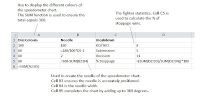
The first task at hand is to
enter the data that we want to use for our chart. This data is displayed below
with formulas shown.
Create a Donut Chart
1.
Select cells A2:A5.
2.
Click the Insert
tab on the Ribbon. Click the Other Charts
button and select the first Donut
from the list.
3.
Right mouse click on the donut and select Format Data Series. Enter 90 degrees as
the angle of first slice. This will position the 180 degree side of the donut
at the bottom.
4.
Remove the Legend on the right by selecting it and
pressing Delete
5.
Make the bottom half of the donut disappear. Click on
the bottom slice twice to select only that slice. Then right mouse click and
select Format Data Point. Select Fill and then the No fill option.
6.
Change the colour of the other 3 slices if you wish.
The finished donut below has been formatted to red, yellow and green slices. To
do this follow the steps as before but choose a Solid fill for your colour.
Create a Pie Chart
The pie chart will be created
to form the needle of the speedometer chart.
1.
Select cells B2:B5.
2.
Click the Insert
tab on the Ribbon. Click Pie and
select the first chart in the list.
3.
As before, right mouse click on the pie chart and
select Format Data Series. Change
the angle of the first slice to 90 degrees. Again this will position the 180
degree slice at the bottom.
4.
Remove the legend from the chart.
5.
Make all the pie slices except for the needle
transparent. Do this by right clicking on the slice and selecting Format Data Point. Select Fill and then No fill.
6.
Repeat this for the Chart Area. This will make the
chart background transparent. The needle should be correctly positioned on top
of the donut.
Add Text Boxes for Labels
The labels on the chart were
created by inserting text boxes.
1.
Click the Insert
tab on the Ribbon and then the Text Box
button.
2.
Click where you would like to position the label.
3.
Enter the required text and then format as necessary.
To save time in the future, you
can save the 2 charts as chart templates. Next time you need a speedometer
chart, the task would be as easy as selecting the data and inserting both
charts (Find out more on how to use chart templates).


No comments:
Post a Comment