Excel provides many functions that are capable of predicting future values that reflect past data. These different functions cater for the different ways that your data may be plotted. For example, if your data has a steady growth or if it fluctuates dramatically.
They include FORECAST, TREND, LINEST and GROWTH to name a few.
However in this tutorial we will focus our attention on adding a trendline to a chart to forecast future values.
Adding a Trendline to a Chart
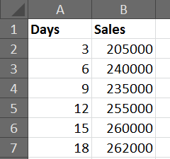
For this example we will be using the sales data displayed below. We would like to forecast the sales for the next 3 periods (9 days) based on the sales from the previous 6 periods (18 days).
Click the Layout tab on the Ribbon and then Trendline (This option has changed a little over time. This example is for Excel 2007 and 2010).
Select More Trendline Options.
There are 6 different types of trendline to choose from for your chart. The list below explains how you can decide which one is best for your data.
Linear – Used for values that increase or decrease at a steady rate.
Logarithmic – Used for values that increase or decrease quickly before levelling out.
Polynomial – Used for values that fluctuate.
Power – Used for values that increase or decrease at a specific rate.
Exponential – Used for values that increase or decrease at increasingly higher rates.
Moving Average – Averages out the high and low points smoothing any fluctuations.
Select the trendline that best suits your data from the options provided.
In the Forecast Forward field, enter the number of periods in the future that you wish the trendline to display for.
Before we add the trendline, another useful option in this dialog box is the Display R-squared value on chart checkbox. The R-squared value represents the accuracy of the trendline.
This value is a number between 0 and 1. The closer to 1 that the value is, the more accurate the trendline.
The image below shows a linear trendline added to the chart. It has an R-squared value of 0.8236, which is fairly accurate.
However our sales appear to be levelling out.
The image below shows a logarithmic trendline being used on the chart instead. An R-squared value of 0.9186 indicate that this trendline is a better reflection on the past data.


No comments:
Post a Comment